Space-themed kiosk application for Multimedia Development class
As part of my first semester course work in my grad program in UNK’s Instructional Technology program, I took a course called Multimedia Development, which asks students to “plan, design, develop and manage a major multimedia project”. The instructor asked that we all use Flash to execute the project, which is typically taught to students in a prerequisite for this class. However, I came into the program already proficient in Flash and AS3, so I was able to hit the ground running and develop a more advanced project from the beginning.
Planning phase
At the beginning of the semester, I had an informal agreement to develop a kiosk application for a local business, and I thought it would be the perfect opportunity for my class project as well. The business requested that the application have a space theme and be simple enough for children to operate with the assistance of a chaperon.
I began by brainstorming general ideas on paper, by simply making large lists and clouds of keywords and themes that may be applied to space-themed applications like what I was trying to create. I then evaluated these lists and selected a small set of ideas that resonated with me (for whatever reason).
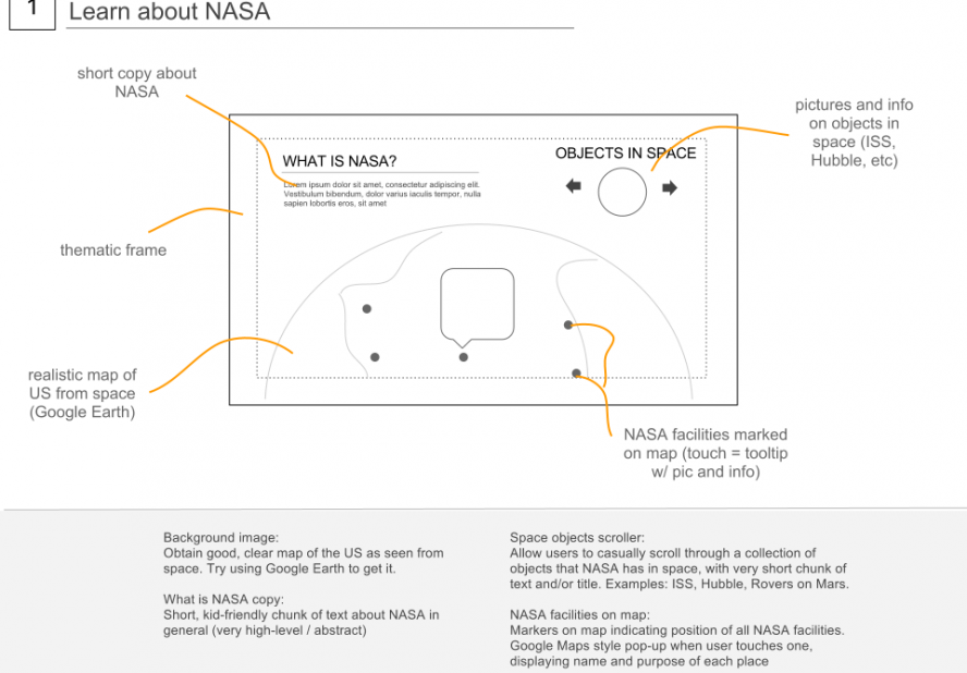
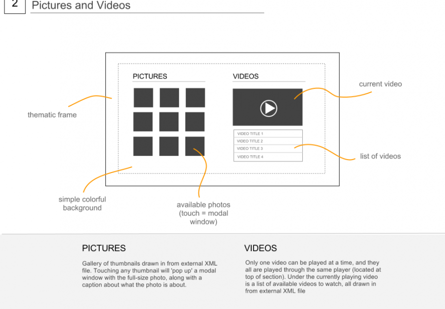
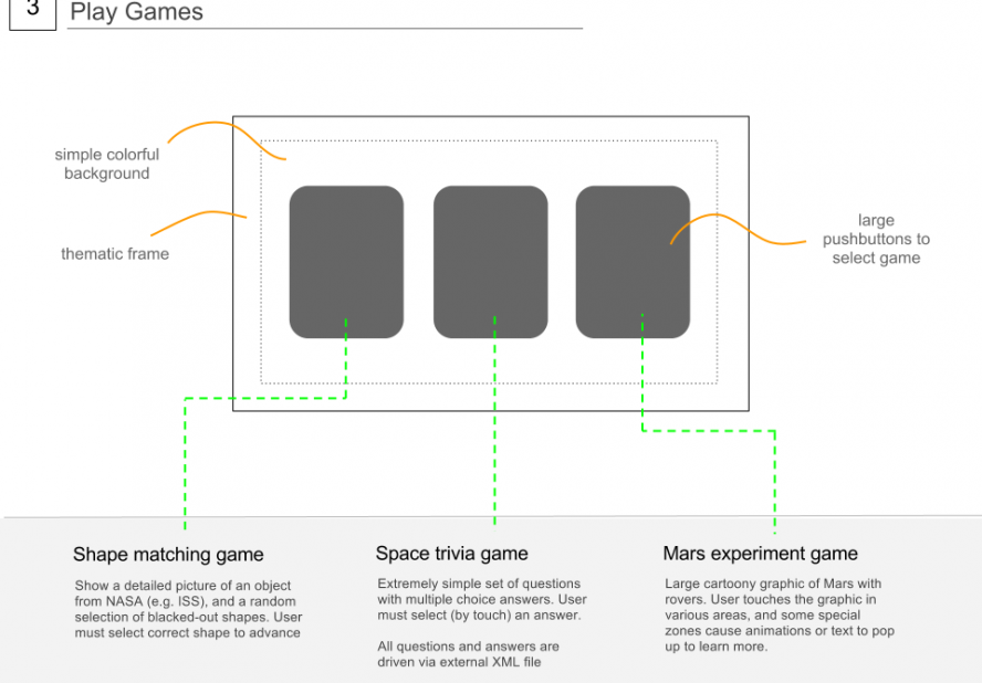
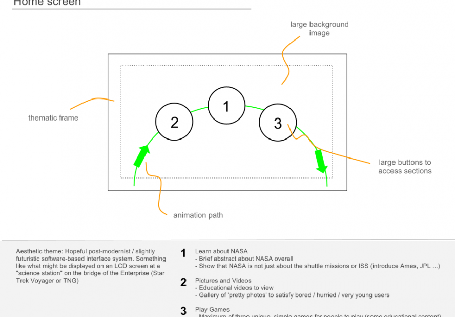
After organizing my initial thoughts, I used Google Docs to generate some simple annotated wireframes to prototype these ideas.
Design phase
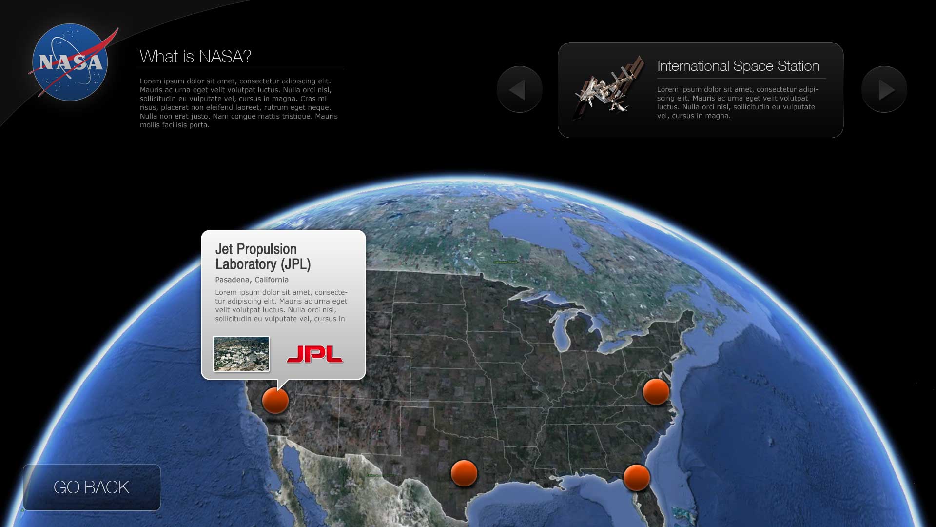
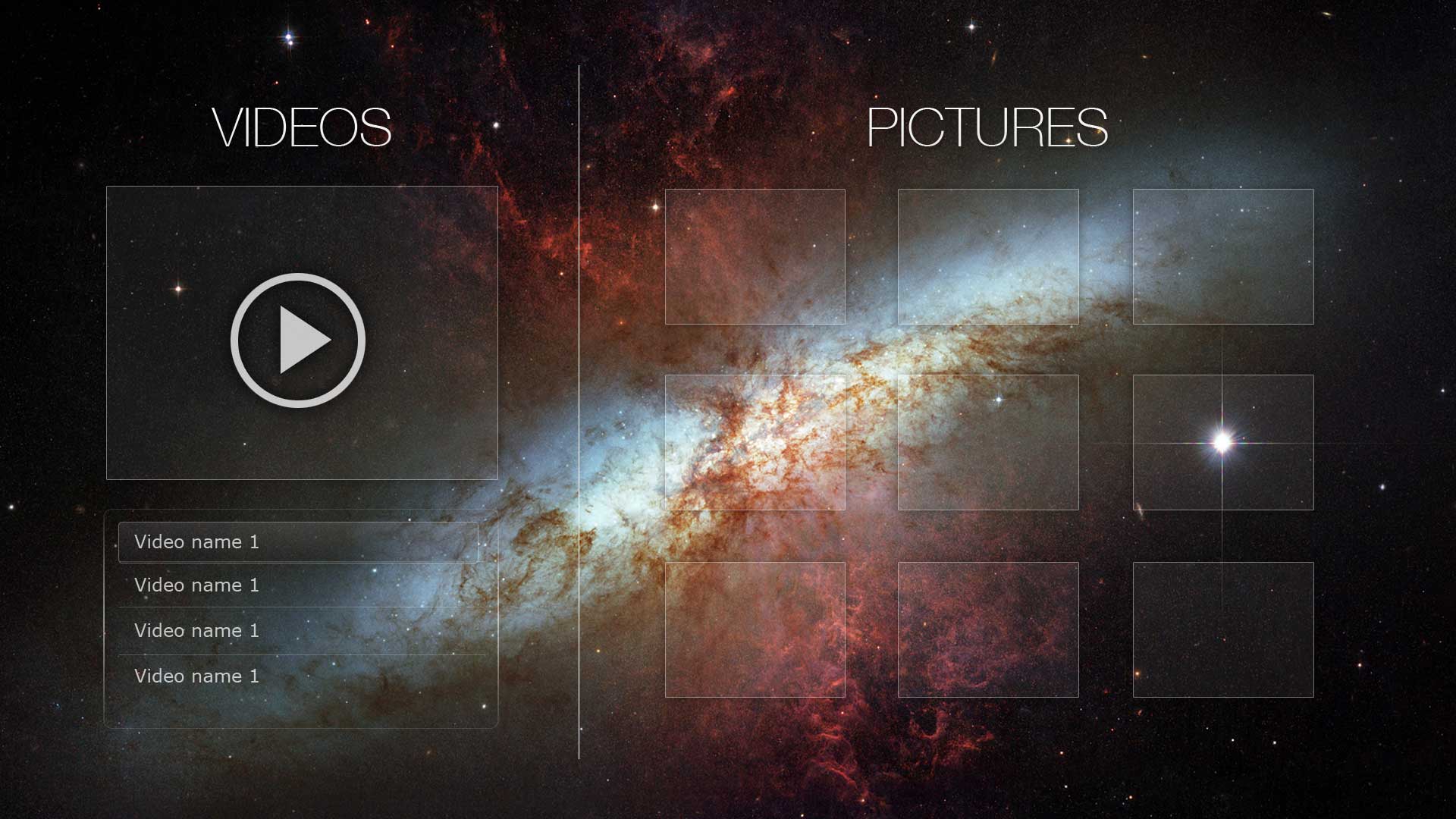
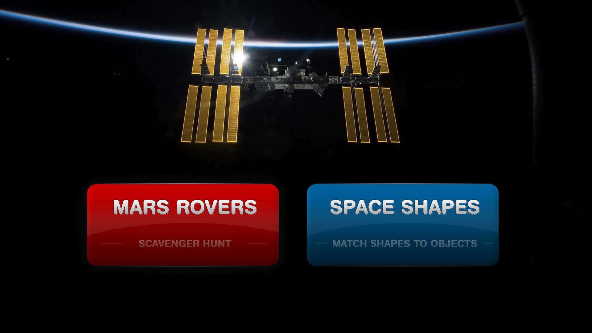
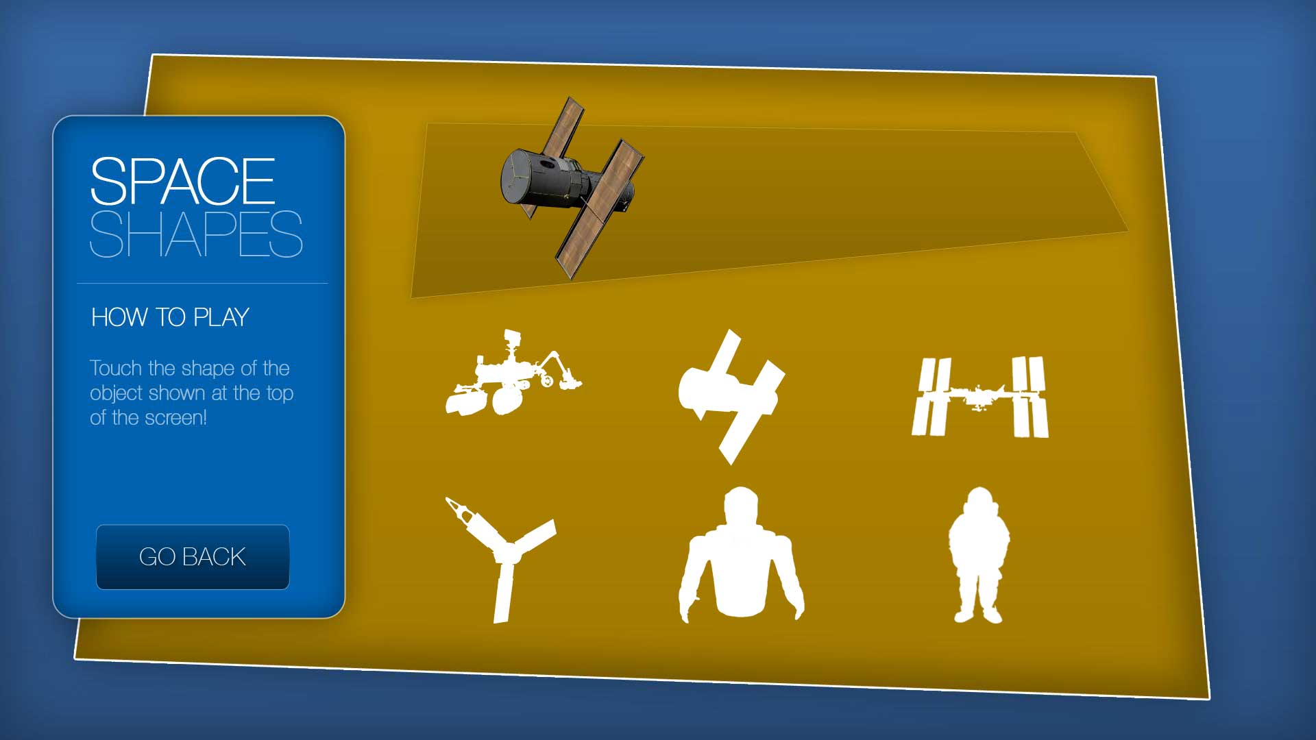
Using these wireframes, I actualized each of the various sections in Photoshop, focusing on creating each of the elements with a minimal and futuristic style. All possible interactions and states are represented in a collection of hidden layers, so I can see exactly what the ‘on’ and ‘off’ states of the various buttons and moving pieces will look like. These design files were then sliced up and exporting into high-quality individual elements for use in the development phase.
Development phase
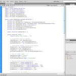 With the design completed, I imported the various sliced up graphical elements into Flash and got to work. Because I am more comfortable with code-based development, rather than GUI-based development, I chose to execute the entire application using object-oriented AS3. I used an explicit package hierarchy to maintain flow control in the application, ‘passing’ focus from one class to another as the user requests it.
Each section of content is represented with a separate class, which is responsible for all local interactions, animations and content management. Each class loads and unloads all relevant graphic elements from the Flash Library as needed and keeps track of its own local state.
Finished project
After about two weeks of development, the final project was ready to submit for a grade. The following is the complete, full-resolution kiosk application that was submitted. Please note that the original plan was to install this on a touch-screen computer with a 1920×1080 display, so it may look huge for those with normal desktop monitors.
